Your Website Is Your First Impression
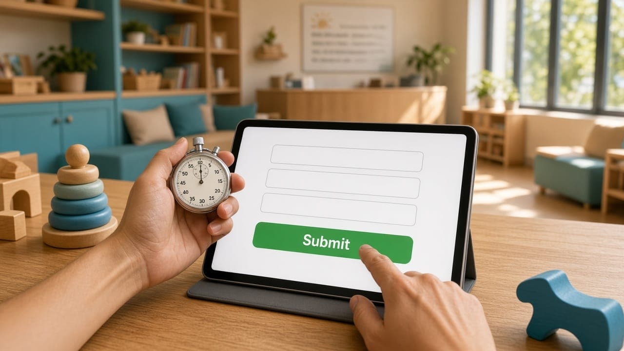
You have approximately 3 seconds to make a first impression when someone lands on your website. In that brief window, visitors decide whether to stay and explore or hit the back button and visit a competitor.
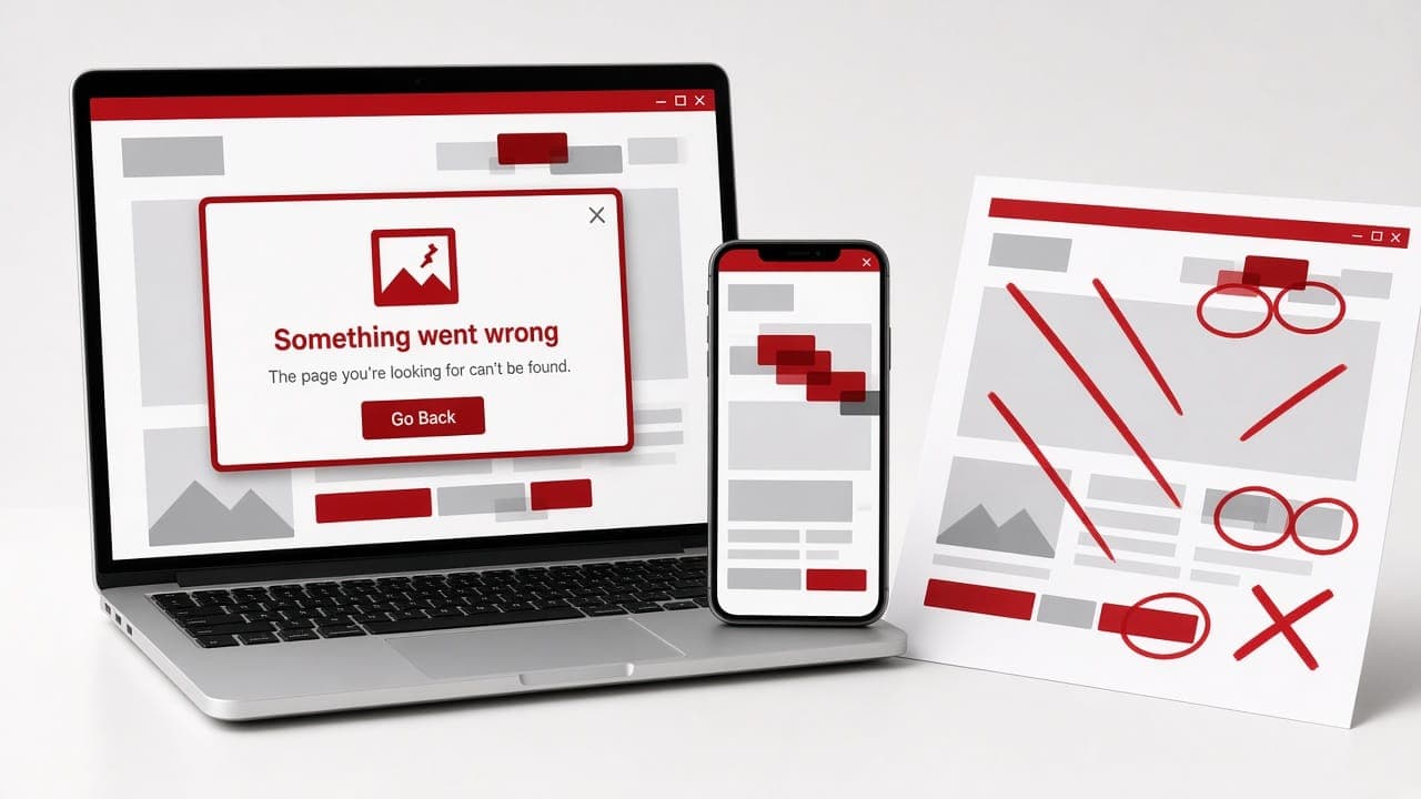
The harsh reality? Most small business websites are making fundamental design mistakes that silently drive away potential customers every single day. Let's fix that.
Mistake #1: Slow Loading Speed
This is the most damaging and most common mistake. If your website takes more than 3 seconds to load, 53% of mobile visitors will leave before they even see your content.
How to fix it:
- Compress all images using WebP format, this alone can reduce image sizes by 60-80%
- Minimise the use of heavy animations and auto-playing videos
- Choose a reliable, fast hosting provider
- Enable browser caching and use a Content Delivery Network (CDN)
- Regularly test your speed with Google PageSpeed Insights and aim for a score above 80
Mistake #2: No Clear Value Proposition
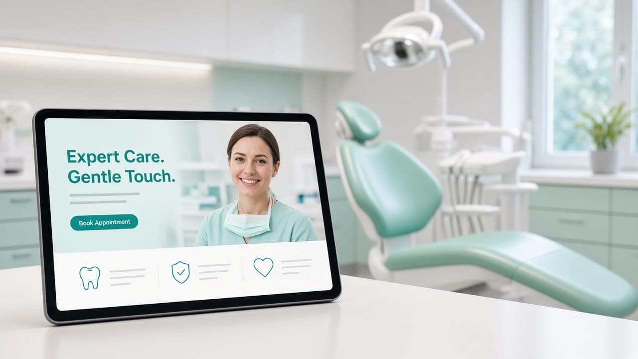
When visitors land on your homepage, they should immediately understand three things: what you do, who you do it for, and why they should choose you over alternatives.
Too many websites lead with vague statements like "Innovative Solutions for a Digital World." That tells the visitor absolutely nothing.
How to fix it:
- Write a clear, specific headline that describes your offering: "We Build High-Converting Websites for Healthcare Businesses in Hyderabad"
- Include a supporting subheadline that highlights your key differentiator
- Place a strong call-to-action button within the first viewport
- Remove jargon and corporate buzzwords, speak like a human
Mistake #3: Poor Mobile Experience
Most traffic arrives on a phone, yet plenty of businesses still treat mobile as an afterthought. A website that looks considered on a 27-inch monitor and is unusable on a mid-range handset is failing the majority of its visitors. Check your own analytics before assuming otherwise; the split is usually more lopsided than people expect.
How to fix it:
- Design mobile-first, then scale up to desktop
- Ensure tap targets (buttons and links) are at least 44x44 pixels
- Use readable font sizes, minimum 16px for body text
- Test your website on actual mobile devices, not just browser simulations
- Simplify navigation for mobile, use a clean hamburger menu with easy-to-tap links
Mistake #4: Confusing Navigation
If visitors can't find what they're looking for within 2-3 clicks, they'll leave. Complex dropdown menus, unclear labels, and buried contact information create friction that kills conversions.
How to fix it:
- Limit your main navigation to 5-7 items maximum
- Use clear, descriptive labels, "Services" is better than "What We Offer"
- Include your phone number and a "Contact" button in the header
- Add a search function for content-heavy websites
- Use breadcrumbs on interior pages so visitors always know where they are
Mistake #5: No Social Proof
People trust other people more than they trust businesses. A website without testimonials, reviews, or case studies is asking visitors to take a leap of faith, and most won't.
How to fix it:
- Feature 3-5 genuine client testimonials on your homepage
- Include client logos of businesses you've worked with
- Add case studies with specific, measurable results
- Display Google review ratings and link to your review page
- Use real photos of clients when possible, stock photos undermine authenticity
Mistake #6: Weak or Missing Calls-to-Action
Every page on your website should guide the visitor toward a specific next step. If your pages end abruptly without a clear CTA, visitors drift away without converting.
How to fix it:
- Include a primary CTA above the fold on every page
- Use action-oriented language: "Get Your Free Quote" instead of "Submit"
- Make CTA buttons visually distinct, use contrasting colors and adequate size
- Include CTAs at multiple points throughout longer pages
- Create urgency where appropriate: "Book Your Free Consultation, Limited Slots Available"
Mistake #7: Outdated Design
Design trends evolve, and a website that looked modern in 2020 now looks dated. An outdated design signals to visitors that your business isn't keeping up with the times, and if you can't keep your website current, can they trust you to deliver modern solutions?
How to fix it:
- Refresh your website design every 2-3 years
- Use clean, modern typography with proper hierarchy
- Embrace white space, it makes your content easier to read and your design feel more premium
- Keep your color palette consistent with your brand identity
- Update your imagery regularly, use high-quality, relevant photos
The Audit Checklist
Here's a quick self-audit you can perform right now:
- ✅ Does your homepage load in under 3 seconds?
- ✅ Can a stranger understand your business within 3 seconds of landing on your site?
- ✅ Does your website look and function perfectly on mobile?
- ✅ Can visitors find your contact information within one click?
- ✅ Do you have at least 3 client testimonials visible?
- ✅ Does every page have a clear call-to-action?
- ✅ Has your design been updated in the last 2 years?
If you answered "no" to even two of these questions, your website is likely costing you customers.
"A great website doesn't just look good, it works hard. Every element should serve a purpose: to inform, to persuade, or to convert."
Don't Let Your Website Work Against You
Your website should be your strongest sales tool, not your biggest liability. The good news is that most of these mistakes are fixable, and the ROI of fixing them is immediate.
At Softivum, we audit and redesign websites with a conversion-first approach. If your website isn't performing, let's talk about making it your most valuable business asset.